Event color coordination is about choosing 3-5 colors that set the tone and style of your event. The right palette creates harmony, influences mood, and ties everything together, from decor to rentals like inflatables. Using tools like the 60-30-10 rule (60% primary, 30% secondary, 10% accent) helps balance the design. Consider factors like venue size, lighting, and seasonal themes to make the most of your colors. Here’s what you need to know:
- Color Psychology: Red energizes, blue calms, yellow uplifts, green soothes, purple adds luxury, and black conveys elegance.
- Color Schemes: Use the color wheel to create monochromatic, analogous, or complementary palettes.
- Practical Tips: Match decor, rentals, and lighting to your chosen palette. Test colors in your venue to ensure they work with existing features.
- Seasonal Themes: Pastels for spring, brights for summer, earthy tones for fall, and cool shades for winter.
Whether it’s a kids’ party or a corporate event, coordinated colors enhance the atmosphere and leave a lasting impression.
Event Color Theory Basics
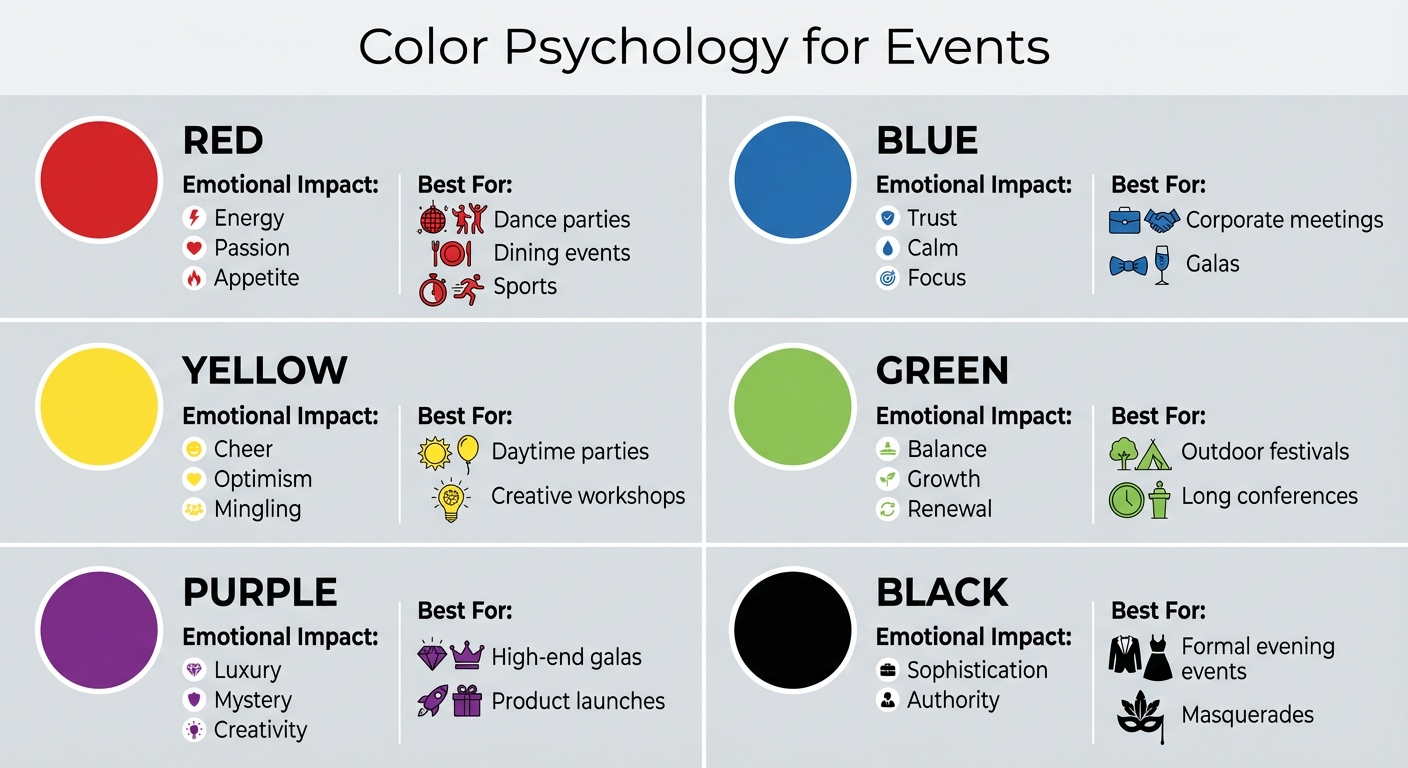
Event Color Psychology Guide: Emotional Impact and Best Uses
Grasping how colors interact starts with the color wheel, a tool that illustrates the relationships between hues. At its core are the three primary colors – red, yellow, and blue – which can’t be created by mixing other colors. Combine two primary colors, and you get secondary colors: orange (red + yellow), purple (red + blue), and green (yellow + blue). When a primary color is mixed with an adjacent secondary color, it forms tertiary colors, such as red-orange or blue-green.
How the Color Wheel Works
The color wheel provides several strategies for creating balanced color schemes. Monochromatic palettes stick to variations of a single hue – like combining navy, sky blue, and powder blue – for a sleek, unified look. Analogous schemes use a main color along with its neighbors on the wheel, such as yellow paired with yellow-green and yellow-orange, for naturally harmonious designs. For bold contrast, complementary schemes pair colors directly opposite each other, such as blue and orange or red and green, creating high-energy, eye-catching combinations.
Each hue on the wheel can also be adjusted to achieve different effects. A tint is made by adding white to lighten a color, a shade is created by adding black to darken it, and a tone results from mixing gray to alter its saturation.
These basics lay the groundwork for using color psychology to enhance your event.
Color Psychology for Events
Beyond their technical properties, colors evoke emotions that can shape how guests experience an event. For instance, red can heighten energy levels – boosting heart rate, blood pressure, and brain activity – making it a great choice for lively birthday parties or romantic gatherings. Blue, in contrast, promotes calm and focus, which is why it’s often favored for corporate meetings or formal galas. Green, being easy on the eyes, is ideal for long events like conferences or banquets where guest comfort is key.
Yellow inspires optimism and encourages social interaction, but it’s best used sparingly as an accent to avoid overwhelming the eyes during extended events. Purple exudes luxury and creativity, making it perfect for high-end galas or product launches, while black adds sophistication and authority, lending itself well to evening formal affairs. Consider cultural nuances as well: in the U.S., red often symbolizes passion or danger, but in China, it represents joy, prosperity, and good fortune.
| Color | Emotional Impact | Best For |
|---|---|---|
| Red | Energy, passion, appetite | Dance parties, dining events, sports |
| Blue | Trust, calm, focus | Corporate meetings, galas |
| Yellow | Cheer, optimism, mingling | Daytime parties, creative workshops |
| Green | Balance, growth, renewal | Outdoor festivals, long conferences |
| Purple | Luxury, mystery, creativity | High-end galas, product launches |
| Black | Sophistication, authority | Formal evening events, masquerades |
These insights help guide decor and rental choices to create a cohesive and impactful event atmosphere.
The 60-30-10 Rule
The 60-30-10 rule is a simple formula to ensure a visually balanced color scheme. The dominant color should make up 60% of the space – think walls, large decorations, or key features like inflatables from Bouncy Rentals USA. The secondary color takes up 30%, appearing in elements like tablecloths, drapery, or furniture. Finally, the accent color fills the remaining 10%, used for details like napkins, centerpieces, candles, or lighting.
"A good color story lets the primary color shine without making a space feel overwhelming or flat." – Alicia Haniford, QC Event Planning
For example, a summer backyard party might use 60% tropical blue (in water slides and main decor), 30% sandy beige (in table settings and seating), and 10% bright coral (in balloons and small accents). This approach keeps the blue theme dominant while allowing the supporting colors to enhance the overall design. Even monochromatic schemes can follow this rule – like 60% light blue, 30% navy, and 10% true blue – for a layered, refined look.
How to Build Your Event Color Palette
What to Consider When Choosing Colors
When creating a color palette for your event, start by thinking about the event’s purpose, the audience, and the venue itself – including its decor, lighting, and the time of year. A corporate conference will call for a completely different vibe than a romantic wedding or a playful birthday party. It’s also important to consider the attendees – their age, cultural background, and preferences can all influence your choices. Keep cultural sensitivities in mind when selecting colors to ensure they resonate appropriately.
The size and lighting of your venue play a big role, too. Light shades like whites and creams can make smaller or darker spaces feel more open, while rich, dark tones can add a sense of warmth and intimacy to larger venues. Seasonal colors can also enhance the event’s atmosphere – pastels are perfect for spring, jewel tones feel right for fall, and cool blues and silvers work beautifully in winter.
For corporate events, incorporating brand colors subtly can reinforce your branding without overloading the space with logos. For themed events, choose colors that match the story you’re telling – think tropical yellows and blues for a beach party or earthy greens and browns for a nature-inspired gathering. A well-balanced palette usually includes one primary color, one to three complementary shades (often neutrals), and one accent color to tie everything together.
Once you’ve outlined your event’s needs, digital tools can help you refine your choices.
Tools and Techniques for Creating Palettes
With your event’s goals in mind, take advantage of digital tools to craft the perfect palette. Platforms like Adobe Color and Coolors allow you to experiment with different color schemes, while the Sessions College Color Calculator can help you expand a single base color into a full palette. If you have a specific inspiration – like a sunset photo or a fabric sample – tools like BeFunky‘s Color Picker can extract exact colors for you.
Before finalizing your palette, try creating a mood board using BeFunky’s Collage Maker to see how your chosen colors, textures, and images work together. It’s also a good idea to test your colors with physical swatches at the venue itself. Lighting can drastically change how colors appear – blue or purple underlighting pairs well with tech-focused events, while warm reddish-orange lighting feels right for rustic outdoor gatherings. When discussing your palette with vendors, use precise terminology: a hue refers to the pure color, a tint is mixed with white, a tone is mixed with gray, and a shade is mixed with black.
Seasonal and Theme-Based Color Palettes
A well-thought-out color palette ties together every element of your decor, from floral arrangements to larger installations. Aligning your palette with the season creates a natural connection for your guests. For example:
- Spring: Soft shades like light pink, peach, sage green, and eggshell white.
- Summer: Bright, energetic combinations like lemon yellow, lilac, tropical blue, and sunny yellow.
- Autumn: Warm, earthy tones such as burgundy, rust red, burnt orange, and deep brown.
- Winter: Elegant choices like navy, ivory, silver, and charcoal gray.
Themes can build on these seasonal foundations. A carnival bright theme might feature bold primary colors – red, yellow, and blue – with crisp white accents, which pair perfectly with vibrant inflatables from Bouncy Rentals USA. Spring pastels with soft pinks, mint greens, and buttery yellows are ideal for baby showers or garden parties. For a more formal affair, elegant neutrals like champagne, taupe, and ivory with gold accents create a refined atmosphere. You can also draw inspiration from your local surroundings to create palettes that feel grounded and natural, especially for outdoor events.
Applying Colors to Décor and Party Rentals
Main Décor Elements to Coordinate
Once you’ve chosen your color palette, it’s time to weave it into every detail of your event. A great rule of thumb to follow is the 60-30-10 rule: 60% primary color, 30% neutral or base color, and 10% accent color.
Start with large, neutral-toned pieces like linens to create a balanced foundation. Think tablecloths, draperies, and chair covers – these neutral elements help ground your color scheme and keep the overall look cohesive without overwhelming the space. Then, bring in your vibrant accent colors through smaller details like napkins or table runners. Don’t forget to factor in the venue’s existing features – walls, floors, and trim should complement your chosen palette rather than clash with it.
As you move through your planning, apply these same principles to other key elements, like inflatables, to ensure everything works together harmoniously.
Matching Inflatables with Your Décor
Inflatables like bounce houses or water slides can either enhance your event’s design or feel out of place, depending on how you incorporate them. Consider how their colors fit within your 60-30-10 framework. For instance, a bold red-and-blue bounce house might work perfectly as a primary color element for a carnival-themed event, especially when paired with matching table décor or signage from Bouncy Rentals USA. For more subdued or elegant themes, choose inflatables in neutral or muted tones – or place them in a designated play area to keep them from clashing with the rest of your décor.
When using inflatables with brighter colors, balance them with neutral elements like tents, tablecloths, or nearby drapery to create visual harmony. Every rental should align with your initial palette to maintain a polished and unified look.
Keeping Colors Consistent Across Rentals
Before locking in your rentals, assess the overall tone of your colors. Mixing too many warm tones (reds, oranges) with cool tones (blues, greens) can feel mismatched unless done intentionally. Neutral shades like white, ivory, gray, or beige can help bridge vibrant hues and keep the space balanced.
This attention to detail should extend to all rental items, including concession equipment like cotton candy machines, popcorn carts, and snow cone makers. These items often feature bright reds, blues, or classic carnival stripes, which might not align with softer or pastel palettes. If that’s the case, consider grouping them in a refreshment zone or using neutral fabric to tone down their appearance.
To avoid surprises, create a mood board or Pinterest collection to visualize how your primary, base, and accent colors interact across every element. This step ensures every choice supports your event’s overall color story and keeps the design cohesive.
Color Coordination Tips by Event Type
Kids’ Parties and Family Events
For children’s parties, lively and bold color schemes are a must – they reflect the energy and imagination of kids. A great way to achieve balance is by following the 60-30-10 rule: dedicate 60% of your color scheme to large elements like bounce houses, 30% to décor such as tablecloths and furniture, and 10% to smaller accents like balloons. For example, a superhero-themed party could feature a red bounce house from Bouncy Rentals USA, blue table linens, and yellow napkins or party favors to tie it all together.
Even the food and drinks can match the theme. Think blue slushies and ocean-decorated cupcakes for an underwater adventure or green guacamole paired with lime punch for a nature-inspired celebration. This kind of attention to detail keeps kids engaged and makes the event more memorable.
Lighting also plays a big role. Blue or purple lighting can enhance cool, imaginative themes, while warm lanterns work well for rustic or cozy settings. Just be cautious with overly saturated colors on large surfaces, as they can overwhelm the eyes. Pair vibrant shades with neutral tones for a balanced and visually appealing setup.
While these ideas are perfect for playful gatherings, professional events call for a different approach.
Corporate and Community Events
Unlike kids’ parties, corporate and community events benefit from more refined and understated color palettes. Neutral tones like blues, grays, and blacks set a polished tone, while subtle hints of brand colors can be incorporated through signage, table linens, or other décor elements.
A good rule of thumb here is the 3-5 color rule: choose one dominant base color, one to three complementary or neutral shades, and one standout accent color. For instance, a company picnic could feature navy as the base (used for branded tents or tablecloths), white as a neutral (serving ware and linens), and a corporate accent color like orange for napkins, balloons, and signage. Even playful elements like inflatables from Bouncy Rentals USA can be seamlessly integrated into designated activity zones, ensuring they don’t clash with the overall aesthetic.
Outdoor and Backyard Gatherings
Outdoor events offer a chance to draw inspiration from nature. Seasonal colors work best: soft pastels like blush pink, sage green, and cream are perfect for a spring garden party, while warm shades like burnt orange, deep burgundy, and golden yellow complement the cozy vibe of fall gatherings.
The size of the space also matters. Lighter colors can make small areas feel more open, while darker tones create a sense of intimacy in larger spaces. Floral arrangements are an easy way to tie your color palette to the natural surroundings. And if the weather is cool or wet, consider practical options like dry slides to keep the fun going without worrying about muddy messes.
Fixing Common Color Coordination Problems
Building on your chosen color palette and the 60-30-10 rule, let’s tackle some common challenges when coordinating colors effectively.
Preventing Visual Clutter
One frequent issue is going overboard with too many colors. When you mix six, seven, or even eight shades, the result often feels chaotic and disorganized. The fix? Limit yourself to three to five colors total. This typically includes one dominant color, one to three complementary or neutral shades, and one accent color to tie everything together.
Another problem is uneven color distribution. Using your primary color across the entire space can make it feel monotonous and overwhelming. Instead, balance your palette by incorporating complementary and accent colors in the right proportions. This approach creates depth and interest without adding clutter.
Handling Clashing Tones
Once you’ve simplified your palette, it’s important to ensure your colors work well with the venue’s existing features. Clashing tones often happen when the venue’s dominant colors – like burgundy carpets, beige walls, or wood paneling – don’t align with your decor. Ignoring these elements can throw off your entire design.
To fix this, use neutral tones to bridge conflicting colors. Neutrals can soften bold clashes, but be careful not to overdo it, as too much neutrality can make your design feel bland.
Adjusting for Lighting and Venue Limits
Lighting and venue features can dramatically affect how colors appear. Cool tones, for instance, look deeper under dim, cool lighting, while warm tones become more vibrant under lanterns or candlelight.
If the venue’s colors don’t align with your scheme, lighting and drapery can help. Event expert Brian Green offers this practical advice:
"Worry less about floors, ceilings, and walls in a venue. Floors get covered approximately 80% by tables, chairs, and a huge dance floor and stage. Walls and ceilings can be manipulated by lighting or drapery."
For example, blue or purple uplighting complements cool, bright palettes, while reddish-orange lighting enhances rustic or outdoor designs. Additionally, the right colors can transform the feel of a space: lighter tones make small venues feel more open and airy, while darker colors can add warmth and intimacy to larger spaces.
Conclusion and Key Takeaways
Choosing the right colors can turn any event into an unforgettable experience. The way you incorporate colors sets the mood, reinforces your theme, and leaves a lasting impression on your guests.
A great starting point is the 60-30-10 rule: allocate 60% to your primary color, 30% to a neutral hue, and 10% to an accent color. This approach keeps things visually balanced while allowing your chosen palette to stand out. Also, keep in mind how colors can influence emotions – red can energize and excite, while blue tends to create a calming and peaceful atmosphere. This simple framework ensures your design feels cohesive and impactful.
Use the color wheel to find complementary combinations, but don’t forget to consider factors like venue lighting and existing decor. Neutrals such as white, cream, or gray can help tie together contrasting tones. Even the smallest details, like napkins, straws, or chair sashes, can make a big difference in creating a fully immersive event experience.
To complete your vision, incorporating high-quality rentals can elevate your event’s aesthetic. Bouncy Rentals USA offers a variety of colorful inflatables and party rentals that can be tailored to your theme. Whether you’re hosting a lively kids’ party with bold reds and blues, a sleek corporate gathering with neutral tones, or a tropical backyard celebration filled with vibrant greens and yellows, their bounce houses, water slides, obstacle courses, and other party essentials bring your plans to life.
Thoughtful color coordination does more than beautify your event – it enhances your guests’ experience and ensures your event is remembered. By combining timeless design principles with practical rental solutions, you can create an event that feels seamless, engaging, and uniquely yours.
FAQs
How can I use the 60-30-10 color rule to create stunning event decor?
The 60-30-10 rule is an easy-to-follow guide for creating a balanced color scheme, whether you’re planning a sophisticated wedding or a lively birthday party. Here’s how it works: start with a dominant color that covers about 60% of the space. Think tablecloths, large drapes, or even a balloon backdrop. Then, choose a complementary secondary color for 30% of the decor – this might include chair covers, napkins, or lounge area accents. Finally, bring in an accent color for the last 10%, using it in smaller details like centerpieces, signage, or standout rentals from Bouncy Rentals.
For instance, a wedding could feature ivory or blush as the main color (60%), paired with sage or navy as the secondary hue (30%), and metallic gold or burgundy for that final pop (10%). On the other hand, a kids’ birthday party might lean into bold primary colors like red or blue as the base (60%), playful shades like yellow or orange as the secondary (30%), and fun touches like themed inflatables or colorful popcorn machines for the accents (10%). By sticking to this framework, you’ll achieve a polished, well-coordinated look that feels intentional and visually pleasing.
How does color psychology influence the atmosphere of an event?
Color psychology plays a crucial role in defining the mood and energy of an event. The colors you select can stir specific emotions and set the stage for the overall experience. For instance, warm tones like red or orange are known for their vibrant and energetic feel, making them a great choice for lively parties or networking events. In contrast, cool shades like blue or green exude calmness and tranquility, making them well-suited for weddings, corporate functions, or more intimate gatherings.
A carefully planned color scheme not only amplifies the event’s theme but also creates a cohesive and visually pleasing setting. When colors work together seamlessly, guests are more likely to feel at ease and engaged. By tailoring your palette to match the event’s purpose – be it festive, formal, or serene – you can craft an atmosphere that leaves a lasting impression on everyone in attendance.
How can I make sure my event colors work well with the venue’s existing design?
To make sure your event colors work well with the venue, start by studying the space. Pay attention to key details like wall colors, flooring, and any built-in design elements such as wood paneling or exposed brick. Take photos or bring along color swatches to help you match your palette later. If the venue features bold or dominant colors, it’s a good idea to stick with a neutral base – think white, ivory, or gray – and then add splashes of color with accents like tablecloths or inflatable rentals from Bouncy Rentals. On the other hand, if the venue has softer, lighter tones, you’ll have more flexibility to use bright, vibrant colors.
When choosing your color combinations, tools like the color wheel can be incredibly helpful. Decide whether you want bold complementary colors (like orange paired with blue) or softer analogous shades (such as teal and turquoise). To make sure your selections work, bring fabric swatches or small decor pieces to the venue and see how they look in its lighting. Keep in mind that natural daylight and evening uplighting can dramatically change how colors appear. With some thoughtful planning, you can create a polished, visually striking event that ties the venue and your entertainment setup together beautifully.